

Top 8 mistakes to avoid in website design
Every business deserves a beautiful showcase for its creative ideas/products. If I had a nickel for every time we came across a brand website with great products/concept but poor design, oh well, I would have too many nickels.
Ensure your beautiful idea gets the perfect presentation online by choosing a modern theme that’s in line with current trends in design. A good website has to be responsive i.e. it should look consistent across desktops, laptops, tablets, and phones. The look and feel have to be clean and concise. It should have dense content that’s loved by search engines and at the same time, the content should be to the point and easily scannable by consumers. No one likes to read pages to understand what you offer.
Here are some common mistakes to avoid while designing your website. Make sure your website developer and you are on the same page regarding these points.
Mistake 1 – Using only images and graphics and not much text.
A lot of people do the mistake of just using images to convey their message. While a picture does speak a thousand words and your consumer may understand what you want to convey, a search engine cannot read the text that’s embedded onto an image graphic. So you need to have the key information in text format on your website. Search engines love websites with dense informative text that provides the customers with good information. So if you want to rank high for the relevant keywords, you need to have a website that’s content-rich. So, write, write, and write but remember to keep it relevant and to the point. You can hire good content writers to help put your thoughts into words.
Mistake 2 – Using images that are not up to the standards.
It’s a no-brainer that high-quality content makes the consumer stop and take notice. It’s surprising that some businesses put so much effort into creating top-notch products but then post poorly shot photos in a bad light. Good quality photos and videos by trusted, qualified photographers are crucial for conveying the purpose, unique features of your product, and showcasing your premium brand.
Mistake 3 – No clear call to action
A website full of rich information, great photos, and videos, but no call to action will not convince users to leap into action and make the purchase.
Call to action is a phrase to direct your user exactly what action to take and how to take it. CTA can be as simple as two words (“Buy Now”) or a sentence or two “Would you like to hear about our new products, subscribe to our email updates”. Your call to action should present value to the client and persuade them to take an action.
Another common mistake to avoid is hiding away contact information within pages. Make sure when the client is ready to take any action, your contact information is easily accessible.
Mistake 4 – Having a website that’s slow
It’s important to ensure your website loads fast enough to hold your viewer’s fleeting attention. If your website is too slow, the viewer may just move away to another site. Speed optimization is extremely crucial for image-heavy websites, e-commerce websites.
To check your website’s current speed, run a test on GTMetrix or Pingdom.
Mistake 5 – Mismatched colors, poor design
Before you design your website, while in the branding strategy phase, decide and lock on a color palette to ensure a consistent look and feel across your whole brand. Your website, logo, banners, flyers, branded stationery, etc should be consistent in color and design. Take help from professional graphic designers for a modern and clean look.
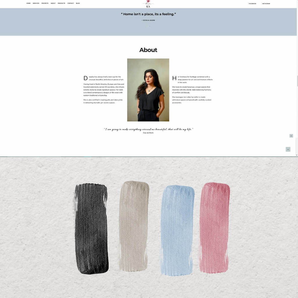
Here’s an example of a website we have built for Decor By KA with a modern and clean layout with an elegant color scheme. You can see how great design can elevate your website
Mistake 6 – Not using clean and modern typefaces Or Using too many fonts
Your website design should look premium and professional. It’s important to get the website and branding collaterals designed by design experts well versed with current design trends. Avoid fonts that look dated or and also avoid cramming too many different fonts into one creative. When it comes to design, less is always more.
Mistake 7 – Not designing for your target audience
A website can convey different messages and appeal to different segments of users based on the style of design and language. For example, a site that looks very professional and to the point may appeal better to a corporate audience whereas if your target market is 20 something men and women, you would want your website to be more hip and trendy. So first decide who is your target market and then conceptualize your design.
Mistake 8 – Chatbots, Pop-ups, Ads on website
Chatbots and pop-ups are so 20th century and are invasive. Keep your design and content user friendly with easy to access contact information and call to actions. Provide great customer experience to ensure return customers. Also, avoid putting ads on your website unless you are providing only free content.
Hope this post was useful. Let us know by dropping a message.
Author

A former R&D Engineer at a reputed IT firm, Neeta switched professions and moved into the role of a Wedding & Lifestyle Photographer and started her own company. Neeta Shankar Photography is today one of the best in the industry; offering beautiful, authentic, no-frills Wedding Photography and Films. Neeta Shankar and her team of photographers and cinematographers specialize in Wedding Photography & Films where they strive to create timeless memories for you which are candid, emotional, offbeat, and fun. They are based in Bangalore but have shot weddings in Delhi, Hyderabad, Mumbai, Goa, Kolkata, Jaipur, Udaipur, and everywhere else because they love to travel! With the experience of shooting over 250 weddings over the last 8 years, Neeta Shankar is known for capturing sincere wedding stories and elegant portraits.


No Comments